User Guide > Working with behaviors > Working with visual states > Change appearances in response to user interaction
Visual states perfectly fit to make your application look more vivid and dynamic. Indeed, an application seems much more responsive when it reacts to user’s actions and provides some kind of visual feedback to a user.
To change the appearance of an element in response to user actions, select the object in the Project Panel. Switch to the Properties section in the Properties Panel, and select one of the available visual state tabs.
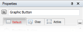
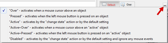
Available states can be selected using the select( ) button.
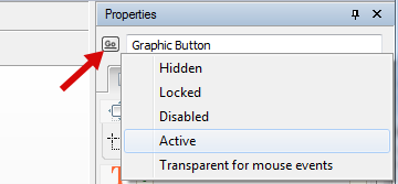
You can choose the default state of the object(Default, Active or Disabled) using the object head menu.
and control and modify it in runtime using the action called “Change object state”, or by changing the internal variables of the object.
Select the state you want to modify, then click the checkbox[ ] next to the corresponding group of properties you want to change to enable it. To expand the full version of the properties dialog, click [
 ].
].
Change properties you want to differ from the default ones. For example, you can display other text when a button is pressed, or change the color of a shape when the user points it with the cursor, or select different parameters for visual effects of an image and so on.
If some property in the states is unchanged, it keeps the default value, so you don’t have to explicitly setup all and every value manually. Note, for Active + Over and Active + Pressed states the default state is Active .
In the Properties Panel this is shown as a grayed square [ ] next to the property name. And on the contrary, if a property has a value different from the one specified on the Default tab, the box displays the checkmark [].
Note, S
Also note that some properties are available in particular states only. For instance, the Tooltip option can be applied only for the Over state of an object.