User Guide > Working with behaviors > Working with visual states
Objects in Autoplay Menu Designer can be in several states depending on how the user interacts with them. The following objects have different states: shapes (lines, ellipses, rectangles etc.), graphics objects (images, graphic buttons etc.), text objects (Cool Text tool, formatted texts etc.) and buttons (including checkboxes and radio buttons).
There are three states the above objects can be in:
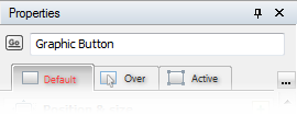
1. Default. The object retains properties set on the Default tab in the Properties Panel. The default state of the object means the user doesn’t click or point that object with mouse, and doesn’t interact with it any other way.
2. Over. The state activates when the user moves the mouse over the element. Properties specified on the Over tab in the Properties Panel come in effect replacing the default settings.
3. Pressed. The state activates when the user clicks the object with the mouse. Properties from the Pressed tab are applied.
Visual states allow you to configure the look and feel of elements of your application depending on what the user does. For instance, changing the color or the font of the button is a common way to indicate that the button is selected when the mouse cursor is over it. Or you can zoom in an image when it is clicked, or play a sound effect when an object is hovered and so on.
In this section