User Guide > Adjusting your workspace > Areas of the workspace > Properties panel
The Properties panel in Autoplay Menu Designer is where you can view and modify the properties of an object selected on the Artboard or under the Project panel. Whenever you modify an object directly on the Artboard with your mouse using the object handles, all property changes are reflected in the Properties panel. The opposite is also true: if you change parameters of an object using the dialog in the Properties panel and modify its position, size, shape or applied effects, the object on the Artboard will reflect these changes accordingly.
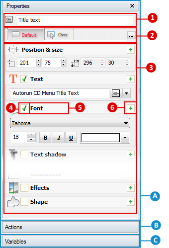
Let’s take a look at the panel more closely. The Properties panel consists of three sections. You can click the name of a section to maximize it, or use splitters to manually set the size of each panel section.
 - Properties section.
This is the default section of the Properties panel. It contains properties and parameters of a given object. These are:
 - Here you can see the name and the type of the selected object. Next to the name box, there is an extended options menu. Click the button to bring up the following context menu:
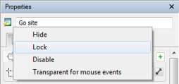
Depending on the object, you can hide it, lock it from changes, disable it or perform other actions.
 - State tabs. Objects in Autoplay Menu Designer can be in one of several states. Now an object can have the following states:
| • | Default |
| • | Over (when the mouse cursor is over the object) |
| • | Pressed (when the object is clicked) |
| • | Active (when the activated object such as a checkbox is active) |
| • | Active + Over (when the mouse cursor is over the active object) |
| • | Active +Pressed (when the active object is clicked) |
| • | Disabled (when the user cannot interact with the object) |
You can select the object state individually :
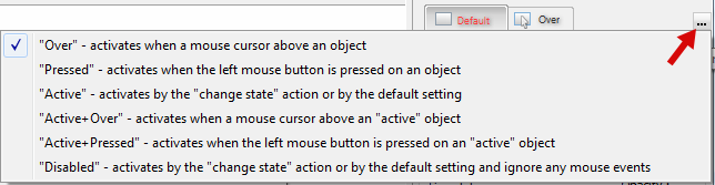
The properties of an object in each state can differ. This creates a possibility to make the interface respond to user actions: links can be highlighted when a user points them with mouse, buttons can literally “press” and so on. Switch between tabs to set properties for each state.
 - Expandable and collapsible categories of properties.
This section displays properties of the selected object or objects split to categories. Depending on the type of the object the set of available properties may be different.
 - An object may use one or more property categories at the same time. This box indicates whether a given category is used in the object.
 - means the property category is turned off and isn’t used in the object. For instance, if the Fill property category is turned off, the object does not have any filling;
 - means the property category turned on and all its parameters apply to the object;
 - is shown if multiple objects are selected in the Project panel or on the Artboard and their properties in that category are different. Clicking on this box allows you to select or deselect a property category for a given object or objects.
 - means the property category uses the values specified for the default state of that object. The default state is convenient if you want the object to preserve most of its default parameters and only change some of them in other states (Over, Pressed).
 - The name of the property category.
 - Click this button to collapse or expand a category.
For more information, see
 - Actions section.
This section describes how objects should act and behave in various situations. Actions are executed when a specified event and/or condition is fulfilled. Autoplay Menu Designer allows assigning multiple actions to each object, and actions’ events are checked then one by one starting from the first. If an event is met, the linked action is executed.
 Note: there are some objects (like the WebBrowser object) that cannot react, so they don’t have the Actions section.
So let’s take a look at the section:
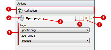
- Adds new action triggered by a certain event to the object.
- Shows the type of the event that triggers the action of the selected object. Note that if you have specified an additional condition while setting up this event, the small gear is displayed over the icon and the name of the action changes accordingly. Click the icon to edit the event or conditions.
- The name of the action. You can click it to customize the action.
- Allows changing the order of actions. Higher actions are executed first.
- Deletes the action.
- Minimizes or restores the action’s property dialog.
 - Brief action property dialog. Here you can change the most common parameters of the action. To open the full-functional editing, click the name of the action.
For more information, see
 - Variables section.
Every object of the project has certain variables. Some of them indicate its state, others contain crucial properties of the object. Some objects, however, do not have any variables you can manipulate. Variables can be used to control other objects activity, they can work as triggers for certain events or can influence to or be influenced by various actions. For instance, you can make objects and controls visible depending on the option a user selects, buttons he or she presses and other conditions.
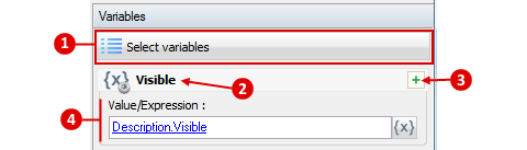
-The button to select internal variables of the object you want to set or remove.
- The name of the variable.
- The button to expand or collapse advanced settings dialog.
- The settings dialog. Depending on the selected object the list of available variables may vary. You can set the exact value to the variable or define it as an expression built from values of other variables and parameters.
For more information, see